Graphic Design in 2026: Why Human, Tactile Visuals Are Back
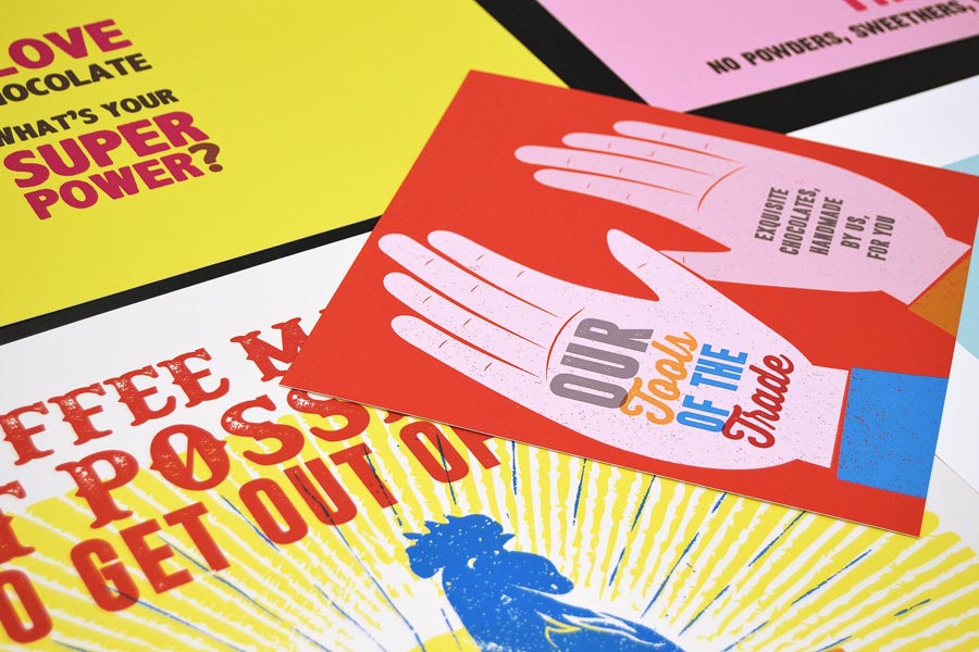
In 2026, graphic design is moving away from overly sterile and impersonal aesthetics. Handcrafted details, visible texture, bold typography, and a warmer visual tone are taking center stage.
What has changed?
After years of polished, machine-like digital visuals, brands are once again looking for a design language that feels more personal and more human. That can mean imperfect lines, hand-drawn elements, candid photography, oversized headlines, and unexpected color choices.
This approach works especially well in print. Paper choice, embossing, textured materials, coatings, and color quality all help make a design feel more physical, memorable, and real.
What stands out right now?
Some of the most visible directions include expressive typography, folk and nature-inspired motifs, saturated color, a controlled sense of maximalism, and subtle references to early-2000s visual culture. At the same time, designers are thinking more carefully about how artwork will reproduce on paper.
That is why more projects are now designed with print in mind from the start, including paper selection, finishing, and environmentally responsible production choices.
Why does this matter for brands?
A brand’s visual style should do more than look current. It should build trust, create recognition, and work across every format — from websites and social media to brochures, packaging, and corporate print materials.
In 2026, good design is not just about beauty. It is about character, consistency, and the right brand feeling at every touchpoint.