LANGU Logo Design & Branding
Overview
LANGU is an agricultural and industrial company with more than 15 years of experience in fruit cultivation and production. The company's orchards cover 200 hectares of intensive farming, with fruit trees grown from seedlings sourced locally and from European countries. LANGU continues to expand its operations, with a new 100-hectare orchard currently being developed alongside its existing agricultural facilities.
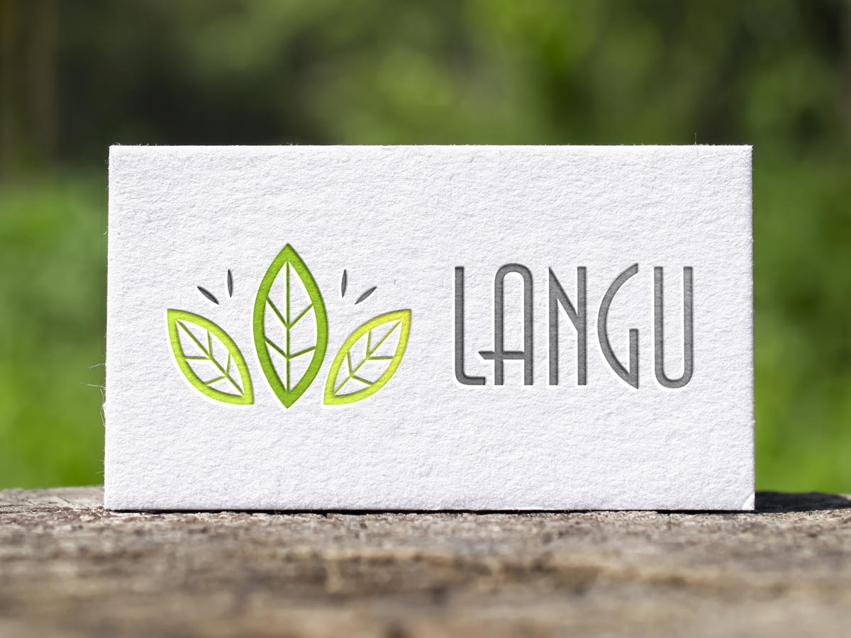
We created a logo for LANGU consisting of a distinctive leaf-shaped graphic symbol and custom lettering. The leaf element reflects the company's connection to nature, fruit cultivation, and agricultural production, while the individual lettering gives the brand a recognizable and cohesive visual identity. Together, these elements form a clean and memorable logo that represents the company's agricultural focus and natural origins.